CSS入门(表现层) – B站狂神说java笔记.
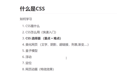
1.什么是CSS.
Cascading Style Sheets 层叠级联样式表
CSS:表现(美化页面)
字体、颜色、边距、高度、宽度、背景图、网页定位、网页浮动。。。
1.发展史.
CSS1.0
CSS2.0 DIV(块) + CSS HTML与CSS分离,网页变的更简单,SEO优化
CSS2.1 浮动和定位(重点)
CSS3 圆角、阴影、动画、、、 浏览器兼容性~(如果要精通就这 可以上菜鸟教程)
2.快速入门.
<!DOCTYPE HTML>
<html lang="en">
<html>
<head>
    <meta charset="UTF-8">
    <tilte>Title</title>
    <!-- 规范:<style> 可以编写css的代码,设一个声明,最好使用分号结尾
        <style>
            选择器 {
                声明1;
                声明2;
                声明3;
            }
        </style>
    -->
    <style>
        h1 {
            color: red;
        }
    </style>
</head>
<body>
    <h1></h1>
</body>
</html>
CSS 优势:
- 内容和表现分离
- 网页结构表现统一,可以实现复用
- 样式十分丰富
- 建议使用独立于html的css文件
- 利用SEO,容易被搜索引擎收录 (用Vue这个框架,是及其不容易被收录的)
3.CSS三种导入方式.
<html lang="en">
<html>
<head>
    <meta charset="UTF-8">
    <tilte>Title</title>
    <!--内部样式-->
    <style>
        h1{
            color:green;
        }
    </style>
    <!--外部样式-->
    <link rel="stylesheet" href="css/style.css">
</head>
<body>
    <!-- 行内样式 -->
    <h1 style="color:red">我是标题</h1>
</body>
</html>
/*style.css*/
h1{
color:yellow;
}优先级: 就近原则(谁里元素最近,就显示谁的样式)
拓展:
外部样式两种写法
导入式(比较少用) css2.1特有的 必须在style标签里面
<!--head标签内--> <style> @import url("css/style.css"); </style>弊端:当你网页代码比较多时,会先展示结构,后
链接式(主流)
<link rel="stylesheet" src="css/style.css">
4. 选择器.
作用:选择页面上的某一个或者某一类元素
4.1 基本选择器.
- 标签选择器 :选中一类标签
- 标签名 {}
- 类选择器:选择所有class属性一致的标签,跨标签
- .类名 {}
- Id选择器(保证全局唯一)
- #id名 {}
优先级:id > class > 标签
4.2 层次选择器(下面的名称是便于理解).
- 后代选择器:在某个元素的后面 所有子代 孙代 。。。
- 子选择器 下面的一代
- 相连兄弟选择器 只是下面的的相连节点
- 通用选择器 自己和自己下面的所有的
<p>p0</p>
<p class="active">p1</p>
<p>p2</p>
<p>p3</p>
<ul>
    <li>
        <p>p4</p>
    </li>
    <li>
        <p>p5</p>
    </li>
    <li>
        <p>p6</p>
    </li>
</ul>
<style>
<!-- 后代选择器 -->
body p {
background: red;
}
<!-- 子选择器 -->
body>p{
background: green;
}
<!-- 相连兄弟选择器: 只是下面的一个 -->
.active + p{
background: blue;
}
<!-- 通用兄弟选择器: 自己和自己下面的所有的 -->
.active~p{
background: yellow;
}
</style>4.3 结构伪类选择器.
格式 selector:pseudo-classes(伪类){}
<h1>h1</h1>
<p>p1</p>
<p>p2</p>
<p>p3</p>
<ul>
    <li>li1</li>
    <li>li2</li>
    <li>li3</li>
</ul>
<style>
/* ul的第一个子元素 */
ul li:first-child{
color:yellow;
}
/* ul的最后一个子元素 */
ul li:last-child{
color:pink;
}
/*选中p1 : 定位到父元素,选择当前的第一个元素 *, 选择当前p元素的父级元素的第一个子元素,并且是当前元素(p)才生效*/
p:nth-child(2){ /*按顺序 如果有其他元素 它的位置也算做其中之一,但是它的样式不会有任何改变*/
color:red;
}
p:nth-of-type(2){/*按类型*/
color:blue;
}
</style>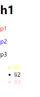
4.4 属性选择器.
<p class="demo">
    <a href="http://www.baidu.com" class="links item first" id="first">1</a>
    <a href="" class="links item">2</a>
    <a href="images/12.html" class="links item">3</a>
    <a href="images/12.png" class="links item">4</a>
    <a href="http://www.baidu.com" class="links item" id="first">5</a>
    <a href="abc" class="links item last">6</a>

</p>
<style>
.demo a{
float:left;
display:block;
height:50px;
width:50px;
border-radius:10px;
background:#270066;
text-align:center;
color:white;
text-decoration:none;
margin-right:5px;
font:bold 20px/50px Arial;
}
/*
标签[属性名=属性值]{}
[属性名=属性值(可以是正则表达式)]
= 绝对等于(属性值及个数都相等)
*= 包含等于
^= 以什么开头
$= 以什么结尾
...
...
*/
/*
存在id=first的元素 选中 背景变红
*/
a[id='first']{
background-color:red
}
/*
存在class=links 背景变绿
*/
/*变不了绿 因为所有class 至少有"links item"组成,而"links item" != "links (绝对等于)" */
a[class='links']{
background-color:green;
}
/*变绿不行 那么 全变黄了; 这个只要包含 links 就可以改变样式" */
a[class*='links']{
background-color:yellow;
}
/*选择href属性值中以http开头 变橙色*/
a[href^='http']{
background-color: orange;
}
</style>5.美化网页.
5.1 为什么要美化页面.
- 有效的传递页面信息
- 美化页面,页面漂亮,才能吸引用户
- 凸显页面的主题
- 提高用户的体验
span标签:重点要突出的字,使用span标签括起来
5.2 字体样式(常用).
- font-family 字体
- font-size 字体大小
- font-weight 字体粗细
- color 字体颜色
5.3 文本样式(常用).
颜色 color
- 单词 red
- RGB 红绿蓝 rgb(r,g,b) 或 #——
- RGBA 红绿蓝透明度 rgba(r,g,b,a);
文本对齐方式 text-align
- center
- left
- right
首行缩进 text-indent
行高 line-height 行高 与 块的高度一致 文本就可以上下居中
装饰 text-decoration
- underline 下划线
- line-through 中划线
- overline 上划线
- none 去划线
文本图片垂直对齐 vertical-align
- top
- middle
- bottom
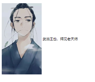
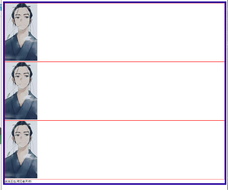
<!doctype html>
<html>
    <head>
        <style>
            /*因为图片-文本垂直居中对齐 是图片和文字相对的,所以两个都要设置*/
          img,span{
               vertical-align: middle;
           }
        </style>
    </head>
    <body>
        <p>
            <img src="2.png"></img>
            <span>武当王也,拜见老天师</span>
        </p>
    </body>
</html>
5.4 超链接伪类.
link 未访问的链接
visited 已访问的链接
hover 鼠标悬浮在链接上
active 被选择的链接
1.hover的声明必须在link和visited之后
2.active的声明必须在hover之后
5.5 文本阴影(新特性).
- text-shadow:阴影颜色 水平偏移 垂直偏移 阴影半径
5.6 列表.
- list-style:none 去掉圆点
- circle 空心圆
- decimal 数字
- square 正方形
- 。。。
5.7 背景.
- 背景颜色 background-color
- 背景图片 background-image :url(“”)
- 平铺 background-repeat
- 默认平铺的 repeat
- repeat-x
- repeat-y
- no-repeat
- background :颜色 图片 图片位置() 平铺方式
5.8 渐变.
/*例子*/
background-color: #52ACFF;
background-image: linear-gradient(180deg, #52ACFF 25%, #FFE32C 100%);
5.9 盒子模型.
margin:外边距
padding:内边距
border:边框
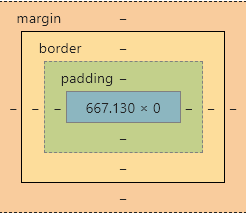
5.9.1 边框 border:粗细 样式 颜色.
- 边框的粗细
- 边框的样式
- 边框的颜色
5.10 圆角边框.
<!doctype html>
<html>
    <head>
        <style>
            /*
                圆角: >= 宽度
                小边宽度构造源
            */
            div{
                float:left;
                margin-right: 20px;
                text-align: center;
            }
            span{
                line-height: 100px;
                vertical-align: middle;
            }
            div:nth-child(1){
                width: 100px;
                height: 100px;
                border: 10px solid red;
                border-radius: 100px;
            }
            div:nth-child(2){
                width: 100px;
                height: 50px;
                border: 10px solid red;
                border-radius: 100px 100px 0 0;
            }
            div:nth-child(2) span{
                line-height: 50px;
            }
            div:nth-child(3){
                width: 100px;
                height: 100px;
                border: 10px solid red;
                border-radius: 30px;
            }
            div:nth-child(4){
                width: 100px;
                height: 100px;
                border: 10px solid red;
                border-radius: 50px;
            }
            div:nth-child(5){
                width: 100px;
                height: 50px;
                border: 10px solid red;
                border-radius: 100px;
            }
            div:nth-child(5) span{
                line-height: 50px;
            }
            div:nth-child(6){
                width: 100px;
                height: 100px;
                border: 10px solid red;
                border-radius: 1000px;
            }
        </style>
    </head>
    <body>
       <!--    border-radius    -->
       <div><span>100px</span></div>
       <div><span>100px</span></div>
       <div><span>30px</span></div>
       <div><span>50px</span></div>
       <div><span>100px</span></div>
       <div><span>1000px</span></div>

    </body>
</html>
5.11 盒子阴影.
box-shadow:水平偏移 垂直偏移 模糊程度(px) 颜色
<head>
    <style>
        div {
            width: 100px;
            height: 100px;
            margin: 0;
            padding: 0;
            border-radius: 20px;
            border:10px solid pink;
            /*阴影 颜色 水平 垂直 模糊程度*/
            box-shadow: red 10px 10px 100px;
        }
    </style>
</head>
<body>
    <div></div>
</body>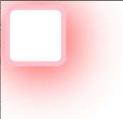
5.12 浮动.
float
- left
- right
display:
- inline
- block
- inline-block
- none:消失
问题:边框塌陷
没有使用浮动紫色的是父级边框
使用浮动后紫色边框被压扁了
解决方法:
- clear
- left
- right
- both
5.13 父级边框塌陷.
1.将父级边框高度设置到比浮动高度大(比较LOW)
.father {
                border: 10px solid rgb(47, 12, 161);
                height: 1000px;
            }
2.增加一个空的div 设置clear 清除浮动
<!doctype html>
<html>
<head>
<style>
.father {
border: 10px solid rgb(47, 12, 161);
}
.father div:nth-of-type(1) {
border:2px solid red;
float: left;
/* display: inline-block; */
}
.father div:nth-of-type(2) {
border:2px solid red;
float: left;
/* display: inline-block; */
}
.father div:nth-of-type(3) {
border:2px solid red;
float: left;
/* display: inline-block; */
}
.clear{
clear: both;
margin: 0;
padding: 0;
border: 1px solid darkgoldenrod
}
</style>
</head>
<body>
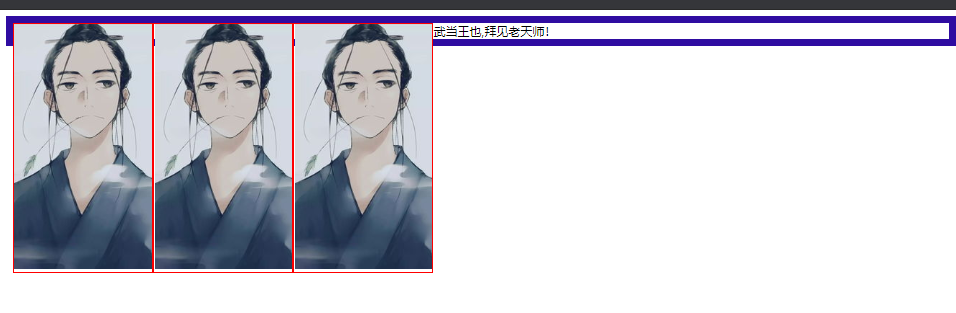
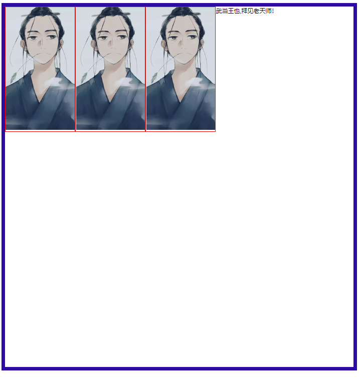
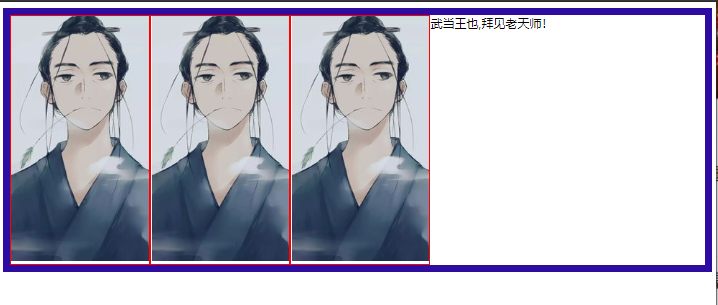
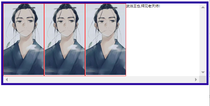
<div class="father">
<div><img src="2.png"></img></div>
<div><img src="2.png"></img></div>
<div><img src="2.png"></img></div>
<span>武当王也,拜见老天师!</span>
<!-- 增加空div clear清除浮动 -->
<div class="clear"></div>
</div>
</body>
</html>
3.overflow 溢出 在父级元素中添加该样式
- hidden 内容超过容器部分隐藏
- scroll 以滚动条方式 容纳全部内容
hidden
 .father {
     border: 10px solid rgb(47, 12, 161);
     /* height: 1000px; */
     overflow: hidden;
}
Scroll
 .father {
     border: 10px solid rgb(47, 12, 161);
     /* height: 1000px; */
     overflow: scroll;
}
- 通过 伪类 :after实现
.father:after {
    content: '';
    display: block;
    clear:both;
}
小结
设置父元素的高度
简单,元素假设没有固定的高度,就会被限制
浮动元素后面添加空div
简单,代码中尽量避免空div
overflow
简单,下拉的一些场景避免使用
父类添加一个伪类,after
写法复杂一点,但是没有副作用,推荐使用
对比.
- display
- 方向不可控制
- float
- 浮动起来的话会脱离标准文档流,所以要解决父级边框塌陷问题
5.14 定位.
5.14.1 相对定位.
- 相对于原来的位置进行偏移
- position:relation
- 他仍然在标准文件流中
5.14.2 绝对定位.
position:absolute
没有父级元素的前提下,相对于浏览器定位
假如父级元素存在定位,我们通常会相对于父级元素进行偏移,在父级元素范围内移动
相对于父级或浏览器的位置,进行制定的偏移,绝对定位的话,它不在标准文档流中,原来的位置不会保留
5.14.3 固定定位.
- position:fixed
5.14.4 z-index.
- 0 - 999
opacity 背景透明度(<1)
filter:Alpha(opacity=50)
margin : 0 auto; 居中的前提
要求: 块元素, 块元素有固定的宽度
###